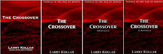
When The Crossover launches on Wednesday, you might not realize that the late-January release involved a lot of November and early-December banging of heads on desks, nightly IM sessions across three time zones going past 1 a.m. (at least in the EST), emails and Dropbox drops. It wouldn’t be too far off to say that there was more pain and suffering over the front of the book than doing the rest of it.
Those of you who follow my Writing Wibbles column might remember that The Crossover was originally called Chasing a Rainbow. Angela Kulig suggested that I search that title on Goodreads. There are hundreds of books with that title, or a really close variant, so we embarked on the first head-desking exercise: coming up with a better title, or at least one that wasn’t already used far too often. The word “Rainbow” was out, it just didn’t ring well. Coming up with a cover became a side project, but one that continued to nag at us. Finally, one night, we were IMing. Angela said “crossing something,” and the title came to me in a flash.
But that was only the beginning.
With the title out of the way, we turned to trying to come up with a book cover. Angela got to where she started dreaming about the cover and the difficulty she was having, finding something suitable. One night, she suggested we find a rainbow photo, monochrome-ify it, and go from there. I was on vacation at this particular time, and it’s a good thing the cottages had wifi. I found a shot on Wikimedia Commons, and I cropped out a piece and started working with it.
We went through several iterations, with different comments each time:
“Darker.”
“We need a different title font.”
“Not that font.”
I learned a lot from this exercise. One thing I learned was how to bang my head on the table at 1 a.m. without waking up everyone else. But it was a good exercise. I learned a ton and a half about titling placement, and what works as cover art. Finally, I heard:
“I think we need a different picture.”
So Angela went out and found one. I wasn’t sure at the very first, but the more I looked at it, the more it grew on me. To me, it harkens back to the abstract fantasy covers of the 1970s.
This all goes to show, it’s always valuable to have someone else involved with producing your book, someone who knows what she’s doing and where to find what she wants.
Angela here! You might think I'm on of those broads that is always changing her mind--and you'd be right; but no amount of awesome content will sell your book as fast as a good cover will.


No comments:
Post a Comment